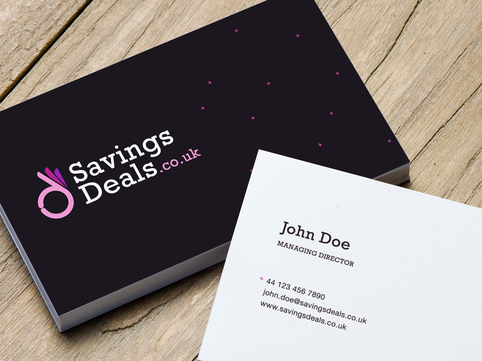
When Savings Deals approached me for a new brand identity, the idea was to keep it light, modern, clean and simple with a vibrant colour scheme.
The website itself was a hub to feature the best money savings options available and would feature many options which you could filter to meet you needs.
As a response to this, I developed a mechanism based on the ‘D’ in the title which would appear as many concentric d’s stacked up but also make up an ‘approval’ hand gesture sign. With the fingers fanning out from the circle of the ‘D’, it also reflected the hub nature of the company.